 Ubuntu Phone documentation
List items
List items can be used to make up a list of ordered scrollable items that are related to each other.
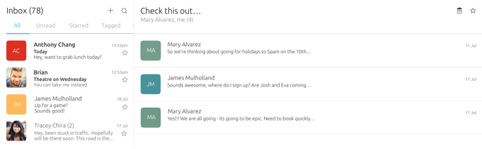
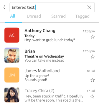
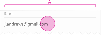
A list of emails
 |
See the ListItemLayout API that provides customisable templates, and the ListItem API that provides swiping actions. |
|---|
Overview
Lists are displayed in a single column layout and are made up of items that can contain one or more controls. Items should be grouped together in a logical way that makes sense to the user.
Items in a form
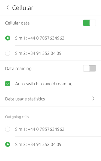
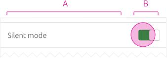
A list of settings
Use appropriately to the content
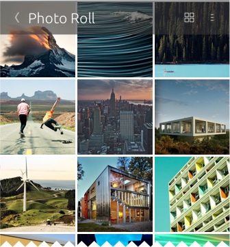
When images or icons are presented without text or actions, it would make more sense to show them inside a grid rather than a list; like in a photo gallery.
Use search function
Consider adding a search function for lists that are likely to contain a large number of items, in order for the users to quickly search a particular item.
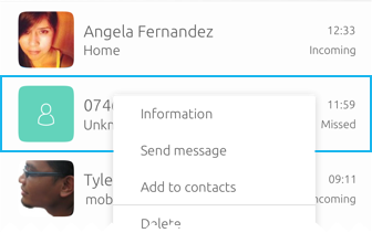
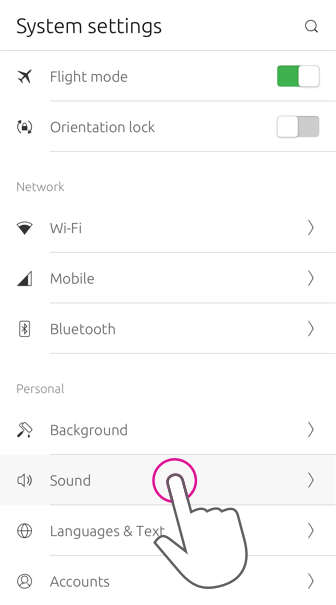
Contextual actions for list items
Items in a list can have actions that can be placed in a context menu. The context menu can be accessed in two ways: by swiping or right-clicking the list item.
Touch and pointer interactions perform the same functions across convergent devices for consistency and familiarity across the platform. Swiping right may reveal a button for the leading action, such as ‘Delete’ or something similar. Swiping left may reveal buttons for (up to) three other important actions; these are the trailing actions. When the user interacts with an item using a mouse, right-clicking will reveal the context menu, and click and drag will reveal the leading and trailing actions either side of the item. This gives the same experience as swiping.
The actions are placed within two categories: leading for negative actions and trailing for positive actions. Grouping actions into positive and negative areas inside your list items will reinforce familiarity inside your app; allowing users to find and identify important actions easily.
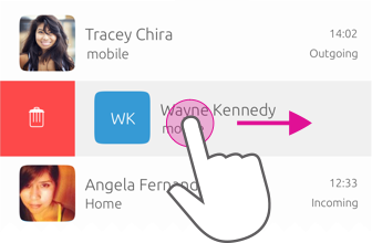
Touch – Leading action
Swipe left to right
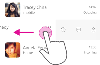
Touch – Trailing action
Swipe right to left
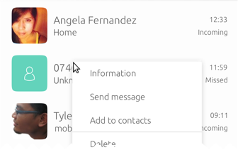
Pointer
A user can right-click to reveal the contextual menu, or drag right to left to reveal the leading or trailing options in an item.
Focus
A user can reveal the contextual menu by focusing on an item using keyboard navigation and hitting a keyboard key to reveal it.
Lists in edit mode
Edit mode allows users to modify a particular item or multiple items at once.
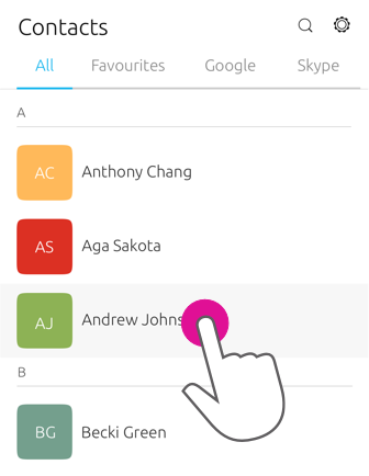
You can use edit mode to allow users to multi-select, rearrange or delete items inside a list. When edit mode is entered the whole screen becomes an edit state and the header will show associated editing actions for the content. Alternatively, if the user long presses an item a context menu will show the associated editing actions too.
Use case
Edit contacts
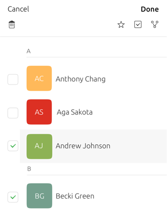
In the Contacts app for example, the list of contacts is made editable to allow users to delete or edit a contact’s information.
-
A user selects an item in the list by using the edit icon in the header.
-
The list becomes selectable with checkboxesthat provides swiping actions for multi-select mode.
-
The header changes to reveal editing actions, and the header section is replaced with a toolbar underneath the main header with further editing actions.
 |
For more information about how edit mode is used see Header. |
|---|
Structure
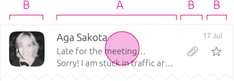
The toolkit provides list item layouts that consist of 1 to 4 slots which can be arranged in a variety of ways. These slots can contain components that allow the list item to perform actions and display content.
Slot A (mandatory)
Can only contain text, such as a title with an optional subtitle.
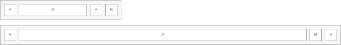
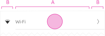
Slot B (optional)
For additional text, an icon or a component.

List items must always contain at least one slot.
Chevron (optional)
If your list item allows for navigation through to an associated view, then a ProgressionSlot (chevron) is used in a fixed position in the right-most slot. No other actions is displayed in this slot, because this would conflict with the chevron navigation.
|
The ProgressionSlot API is designed to provide an easy way for developers to add a progression symbol to the list item created using ListItemLayout or SlotsLayout. |
|---|
Content
If you use the ListItemLayout API then Slot A can contain a 1 line title, a subtitle, and a 2 line summary. If you use SlotsLayout API, you can put whatever you choose in to Slot A. A recommendation is to place the most distinguishing content in the first line of your list item.
Text is always aligned according to the currently displayed language. For example, in the case of English it is left to right, whereas Arabic is right to left.

ListItemLayout labels:
-
1 line – Title
-
1 line – Subtitle
-
2 lines – Summary
|
Developers are free to override the maximum amount lines for each label. See the Label API for more information. |
|---|
Actions
Primary
The primary action is the main action you want a user to perform.
Secondary
A secondary action is an action the user may wish to perform instead of the primary action.
One action
Primary action: a user wants to turn their dial paid sound on or off.
Two actions
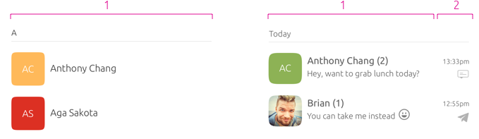
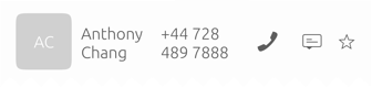
Primary action: a user can call using tap or click on a contacts name.
Secondary action: a user can message a contact by taping or clicking on the message action icon.
Two actions – with primary icon
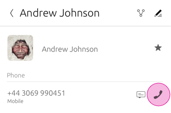
Primary action: call using tap or click on the dial action.
Secondary action: message using tap or click on the message action icon.
 |
Avoid creating visual noise by repeatedly using additional actions in list items. |
|---|
Touch regions
Tapping anywhere in the list item should perform the primary action. The secondary action is only triggered by touching a particular touch region where the action resides.
For example, user will expect to tap on the contact name or call button (primary action) to call a contact. The secondary action would be to message the contact using the message action icon.
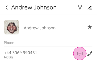
Primary action – call
Secondary action – message
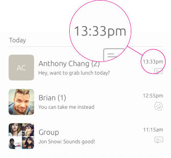
Communicating feedback
You can use a slot to communicate if something has changed within a list item. For example, a timestamp on a message indicates when the message was received and a tick to show the message has been read.
Use text labels
If a list item needs to provide feedback from an associated action, then the list item should not be used to communicate this.
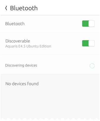
In System Settings if a user has tried to connect to another device using Bluetooth and no device has been found, a text label within the view is used to indicate feedback.
List item layouts
The toolkit provides a number of layouts when creating a list item to ensure users get the best experience from your app across different surfaces.
Consider:
-
Slot A is mandatory and should always contain text.
-
The maximum number of slots is four.
|
You can place what you wish inside the slots. However, these recommendations take into consideration cognitive familiarity to provide a clean and minimalist look. |
|---|
One slot
Two slot
Three slot
Four slot
|
Provide a caption under the title to give the user more information if necessary. For example, displaying a contact’s email address saves the user clicking through to find the information. |
|---|
Avoid cluttered list items
In this example, the list item is too overcrowded and it is not immediately apparent what the primary action is.