 Ubuntu Phone documentation
Selection controls
The following components are used to change the state of a property or setting from a set of predefined values.
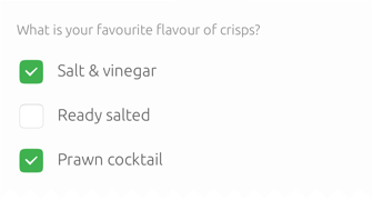
Checkbox
Use a checkbox to enable or select an option from a list; or as a singular option. For example, a singular option that is an instruction to the system such as ‘Show password’, or selecting a property to be applied or unapplied to add or change a setting; such as changing a font style to ‘Bold’ and ‘Italic’.
 |
The Checkbox API is a component with two states: checked or unchecked. It can be used to set boolean options. |
|---|
Multiple options
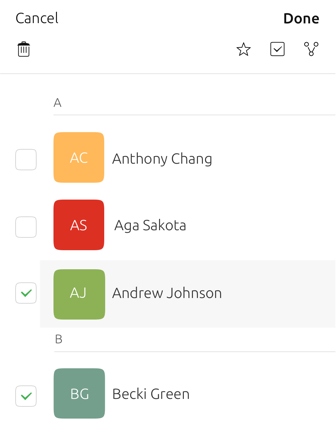
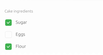
Use multiple checkboxes to allow users to select more than one option. For example, selecting a number of contacts from a list to delete at once.
Single option
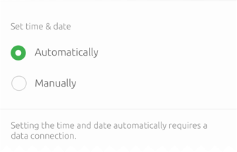
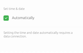
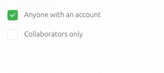
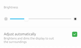
Use stand-alone checkboxes for a single option where the user can turn it on or off, or select or unselect an option. For example, selecting automatic brightness adjustment in System Settings you only need one checkbox.
Use cases
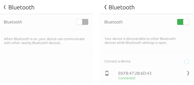
If you are asking the user to turn a setting or instruction on or off, then use a switch instead. For example, turning the Bluetooth setting on or off.
Make the options clear

Do
Use radio buttons or a radio menu if you have enough space for both the label and the option at once. This gives the user a clearer understanding of the choices they can make.

Don’t
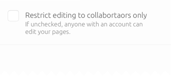
Use a single checkbox when it is not clear what the alternative option is. For example, the user might want to set their time zone manually, so give them that option as well.
Selection
Each checkbox is independent of each other and can be selected individually. However, if the indeterminate checkbox is checked then all checkboxes are selected and unselected, respectively.
Confirmation
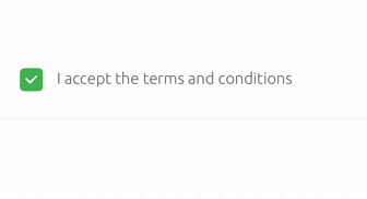
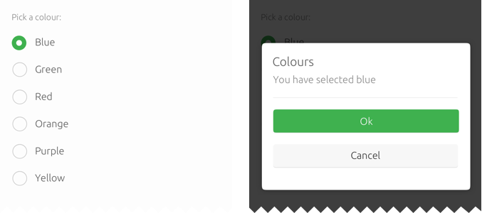
Use for single selection where users confirm an action, such as accepting Terms and Conditions of a setting.
 |
Use indeterminate checkboxes when the value is neither checked or unchecked. |
|---|
Make it obvious
Don’t make it hard for the user to understand the effect of the unchecked value.
Do
Don’t
Alignment
When aligning checkboxes with labels, or other dependent controls, it is important that the user knows which checkbox belongs to the corresponding explanation.
 |
For more guidance on using familiar language and the right tone of voice for labels see Writing (coming soon). |
|---|
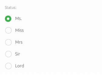
Radio buttons
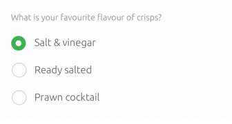
Use radio buttons when there is a list of two or more options that are exclusive of each other and only one choice can be selected.
Choosing a message tone
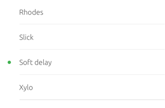
Clicking a non-selected radio button will deselect whichever button was previously selected. For example, ‘Soft delay’ will be deselected if the user selects another option.
|
Options presented with radio buttons require less mental effort, because users can easily compare options as they are all visible at once. |
|---|
One selection – use radio buttons
Multiple selection – use checkboxes
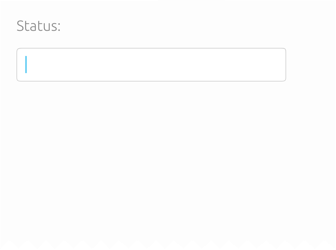
Use other controls if necessary
If you have a selection of options that are long to list and the user could type it faster, then use a text field instead.
Do
Don’t
Don’t use a radio menu entirely for command items. If the menu never contains any radio items, then use a toolbutton menu instead.
|
A toolbutton is a borderless button, as found in the header or a bottom-edge panel. It usually consists of an icons, but may instead contain text buttons. See Buttons (coming soon) for more details. |
|---|
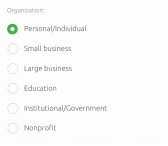
Radio list
If you have a large set of radio buttons then place them in a list. That way users can easily navigate and scroll through the options.
A list of organizations
Don’t interrupt the user
When a user selects an option avoid hindering them from choosing another option by opening up a dialog or closing the window.
Switches
The switch allows the user to perform an action by turning it on or off.
|
The Switch API is a component with two states: checked or unchecked. It can be used to set boolean options. The behavior is the same as CheckBox, the only difference is the graphical style. |
|---|
Use cases
If you are asking the user to turn a setting or instruction on or off, then use a switch.
When not to use
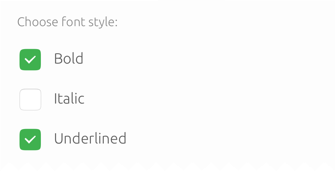
If you asking the user to choose between options to set a value, then use checkboxes or radio buttons instead. For example, choosing a selection of font styles where you can have a combination.
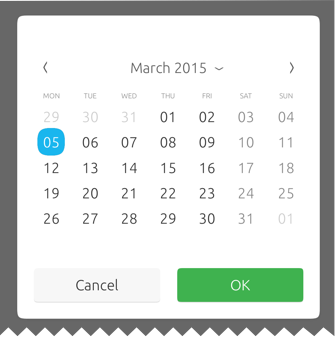
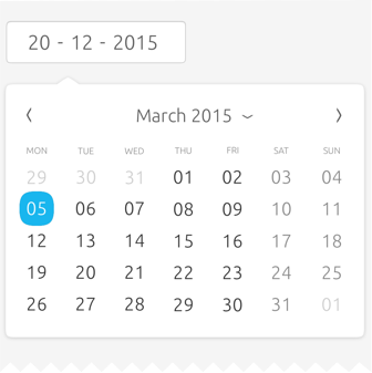
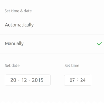
Date and time pickers
The toolkit provides a combination of multiple pickers for you to use to show the time and date in your app.
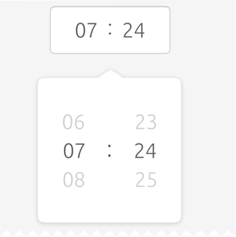
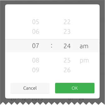
Spinner
Use the spinner component to display a set of values on a reel that can be either flickable or draggable.
|
The PickerPanel API is a component that provides the date and time values with picking functionality. |
|---|
Display month, year and day
Display time
Layout
There are three possible ways you can layout pickers: fullscreen overlay, as a popover, or embedded into the UI.
Fullscreen overlay
Use a fullscreen overlay in larger screen environments, such as tablet or desktop.
Popover
Use for popup or inline calendars when you are short of space.
Embedded
Use for when you want the picker to be expandable and always visible. For example, inside the Clock app you will see it used for when you want to edit an alarm.
Using multi-spinners
The Time Picker supports hour, minute and seconds elements in any combination; except hours with seconds.
Three spinner time picker
|
An AM/PM selector will be added if the 12-hour clock is used. |
|---|
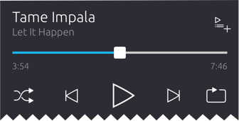
Slider
Use interactive sliders to select a value from a continuous or discrete range of values.
|
The Slider API is a component that allow the user to select a value from a continuous range of values. |
|---|
Slider types
You can choose between different slider types to allow the user to set different values.
|
The interactive nature of the slider makes it a great choice for settings that reflect intensity levels, such as volume, brightness, or color saturation. |
|---|
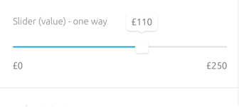
Default slider
You can use this slider to select a specific value or a maximum value in a range. For example, adjusting the screens brightness percentage.
Minimum value slider
Use to select a minimum value in a range, by providing two handles that can select between values. For example, set the value to a minimum price range to make it easier for the user to select between prices.
Interval slider
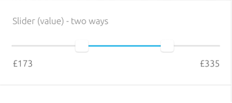
The interval slider has two handles that can select between values. For example, setting a price range between £20 to £40 inside a Shopping app.
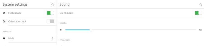
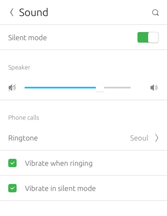
System volume control
A system volume control is a control that any app can embed in its UI. You should use this slider control when your app needs only one volume control.
For example, if you app has a media player or is a game that has sound effects, but no background music.It consists of a slider that automatically reflects and adjusts the audio volume for the current output role through the current output device.
|
The System volume control component is currently under heavy development because it might also include other audio features, so you won’t have to worry about developing it yourself. |
|---|
The advantages of using system volume control:
-
People won’t be annoyed that your app is louder or quieter than others, because your app uses the system audio volume
-
Volume change notifications don’t appear in front of your app when the slider is altered (especially important for a video player)
-
You don’t need to implement your own volume-adjusting code, because Ubuntu changes the volume of your app automatically
-
Any future Ubuntu features for audio routing will become available to your app automatically, without any code changes required
If your app plays multiple types of sound, then provide a mute button and separate volume control for each type. For example, a game that plays background music as well as sound effects. Avoid labelling the system volume control because it already includes icons that indicate its purpose.