 Ubuntu Phone documentation
Design values
This guide is intended to help designers and developers create unique and valuable user experiences.
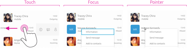
All input types supported equally
In order to achieve convergence, the toolkit has adapted all components to work seamlessly across all devices with minimal changes to functionality and visual appearance.
This means that touch, pointer and focus interactions are now mapped to perform similar functions across different devices for a consistent and familiar user experience. No matter what the input method, the UI will respond to the user’s interaction with what they expect to happen automatically.
Use case
 |
For more details on how a seamless experience can be achieved in your app, see Convergence. |
|---|
Fast and effortless interactions
Allow users to effortlessly move through your app with minimum effort, where it is both natural and logical to them.
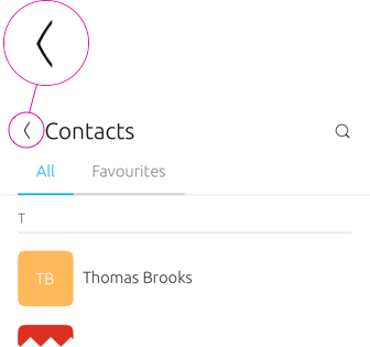
Bottom edge
The bottom edge allows for a natural progressive swipe from the bottom of the screen. By using touch, clicking on the bottom edge tab with a pointer, or pressing Return when the bottom edge tab is focused to open using keyboard navigation.
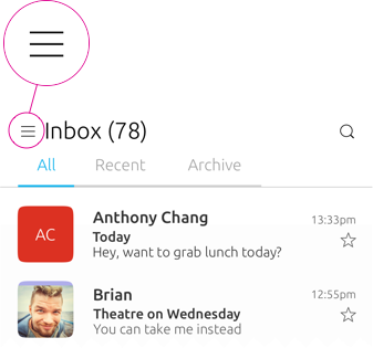
Task switcher
The task switcher allows the user to easily switch between apps or scopes using a right edge swipe. By pushing the pointer against the right edge of the screen, or pressing SUPER+W.
Action placement
Throughout the Ubuntu platform positive actions, such as OK, Yes and Accept are placed on the right, and negative actions, such as Delete and Cancel are placed on the left.
 |
The position of positive and negative actions are important to consider when designing your app, because it can reinforce behavior when used in a consistent way. |
|---|
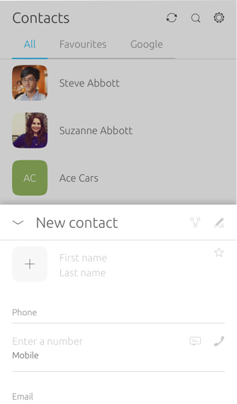
Negative swipes left
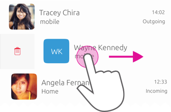
The user swipes left to right to reveals a red deletion option when editing a contact.
Positive swipes right
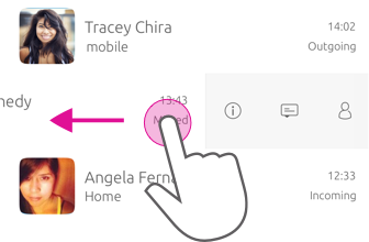
The user swipes right to left to reveal contextual options, such as information and messaging.
|
Users can access the same actions with a pointer or keyboard by pressing the right mouse button or menu key to open a context menu. |
|---|
Meaning in colors
The Suru design language associates meanings with certain colours to help the user distinguish between actions.
Most color blind people have difficulty distinguishing red from green. Don’t use color in isolation, but instead bring them together with additional visual cues (e.g. text labels, button position and style).
|
Think about how colors complement each other and how they can create a harmony that is pleasing on the eye. |
|---|
Green
Positive actions, such as OK, new, add or call.
Red

Negative and destructive actions, such as delete or block contact.
Blue
Blue is an informative colour, it is neither positive or negative. Use blue for selected activity states. It works with all other elements, on both dark and light backgrounds, and stands out clearly and precisely when used in combination with a focus state.
|
For more information on how color is used across the platform see Color palette (coming soon). |
|---|
Focus on content
Too much user interface can interfere with content; but too little can make your app difficult to use. By focusing clearly on content many pitfalls can be avoided.
Make it easy to find content
Allow users to access content easily through navigational methods by using the most appropriate components.

Do
The header can provide quick access to important actions and navigational options at the top of the screen or window.

Don’t
Drawers have low discoverability and can hide important views from the user. Consider using the header or header section instead.