Ubuntu Phone documentation
Convergence
Use one operating system for all devices to provide familiar experiences from phone to tablet to desktop, and back again.
What is convergence?
Convergence is a single user experience that spans to all form factors and adapts to the different contexts of use. It means exactly the same operating system and applications run on phones, tablets and desktops. This is done by using responsive layouts that adapt to the different screen or window sizes.
Convergence supports all input types equally and simultaneously to allow users to interact using a pointer, touch or keyboard; whenever and however they choose.
Why are we doing it?
Over the last twenty years computing has become exponentially faster, cheaper and more power efficient. As a result, phones and tablets today have the processing power to undertake tasks that only a few years ago required PC hardware. The boundaries between form factors are becoming blurred; there is very little difference in terms of hardware between an ultrabook with a touchscreen and a 12in tablet with a keyboard attached.
By using convergence we breakdown the last barrier between form factors with a single operating system and app ecosystem for all different types of hardware. This enables new forms of interaction. For example, drafting an email on your phone during your journey to work, and then when you arrive at your desk you can plug the phone into a monitor and continue composing the same email in a desktop environment.
How are we doing it?
In 2013, Ubuntu announced a crowdfunding effort to build a flagship device called the Ubuntu Edge. It was to be a next-generation smartphone that also worked as a full desktop PC. Although the device was never realized, the vision of a convergent operating system that shifts seamlessly from smartphone to desktop is still alive and well.
Responsiveness and consistency
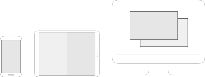
When designing across different sized devices you have to bear in mind how an app will adapt to having more or less real-estate when presented in a small, medium or large screen.
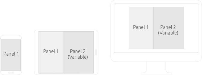
Where possible place panels together to take full advantage of additional screen real estate on different devices, in order to create a consistent and proportionate design that makes use of the available space.
Dekko app
The Dekko app responses to more real-estate and keeps its look and feel from mobile to tablet to desktop.
Adaptive layouts
Applications live in windows (in a windowed environment) or surfaces (in a non-windowed environment). Application layouts change in a responsive manner depending on the size of their window or surface. One common method of creating a responsive layout is to use panels. In a small window or surface, only a single panel needs to be displayed. The user can navigate through the panels by tapping on items or going back. When the window or surface size gets larger, the application can switch to displaying two or more surfaces side by side. Thus reducing the amount of navigational actions the user needs to undertake.
Typical examples of this are applications like contacts, messages, and email. Of course, there can be any number of combinations of panels depending on the specific app’s needs.
The AdaptivePageLayout API component eliminates guesswork for developers when adapting from one form factor to another. It works by tracking an infinite number of virtual columns that may be displayed on a screen at once. For example, an app will automatically switch between a 1-panel and 2-panel layout when the user changes the size of the window or surface, by dragging the app from the main stage to the side stage.
Changing the size of the window or surface resizes one or more joined panels. Typically, the right-most panel resizes and the left-most panel maintains its original dimensions. The dimensions of the right-most panel will normally be 40 grid units or 50 grid units, though this panel may itself be resizable depending on the developer’s requirements.
How it works
The developer will be able to specify where panels should go and the breakpoint in which they can expand to. The adaptive layout will automatically place them.
Minimal changes to functionality
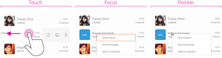
For a consistent and familiar user experience, the SDK maps touch, pointer, and keyboard (focus) interactions to every function.
Context menus
Using touch a user can swipe or long-press on a list item to reveal a contextual menu. Using a pointer (mouse or trackpad) a user can right-click the item to reveal the contextual menu. Using a keyboard a user can focus the desired item and press the MENU key to open the context menu. This is a great example of how each SDK component supports all input types equally and simultaneously.

All the components in the toolkit adapt to a convergent environment. See how the header converges to provide more room for actions within different surfaces.
See for yourself
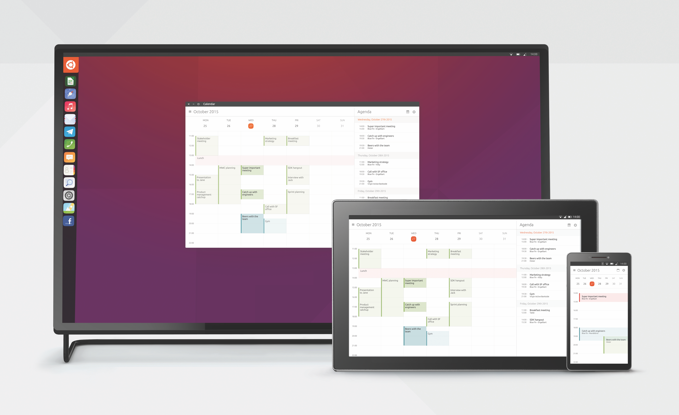
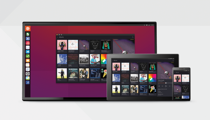
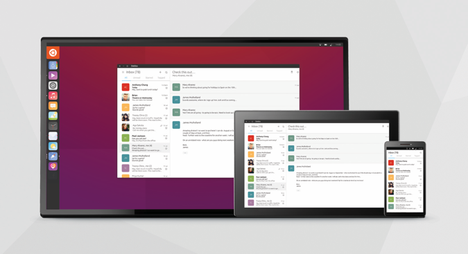
Ubuntu devices are shipped with built-in apps that converge over multiple devices, such as: Dekko, Calendar, Contacts and Music. They all work in the same way on your phone, tablet and desktop, giving you a seamless experience across all devices.