 Ubuntu Phone documentation
Layouts
Make your app consistent and adaptive across all screen sizes with just one API.
 |
The Adaptive Layout API allows you to add multiple columns to a page (under heavy development). |
|---|
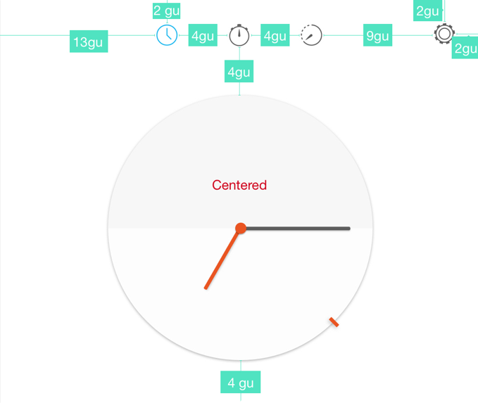
Grid Unit System
A Grid Unit (GU) is a virtual measure of the screen space that is calculated according to the device’s width in pixels and the predefined layout. They have been designed to suit a range of screen sizes.
Placing elements
Use Grid Units to help visualise how much space you have in order to create a consistent and proportionate UI. It proves beneficial for when you are placing components and labels within your app.
Predefined grid unit layouts
The layout is calculated by taking the short edge of the screen and dividing the amount of pixels by one of the chosen predefined layouts, which are:
-
40/50GU for mobile and phablets screens
-
90GU for tablets, desktop and larger screens.
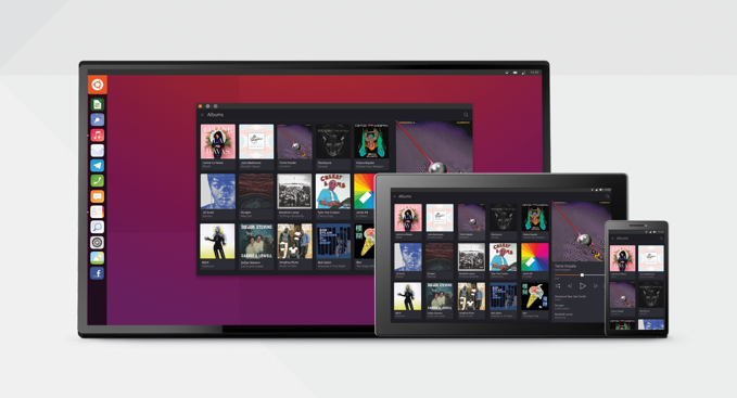
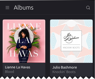
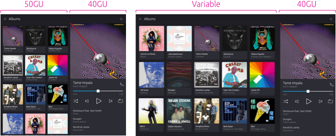
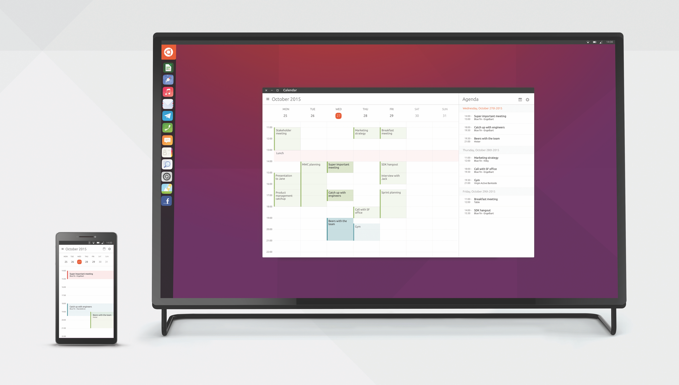
Example of 50GU layout for mobile
A mobile device would typically suit a 50 GU-wide virtual portrait screen, because it offers the right balance of content to screen real estate for palm-sized viewing.
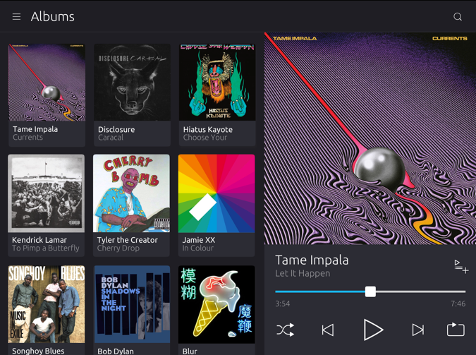
Example of 90GU layout on tablet in portrait mode
90GU is ideal for tablet sized screens, because it offers more real-estate for panels.
 |
See the design blog for developer specifications of Grid Units and layouts. |
|---|
Layouts
Panels
A panel is a way of grouping together Grid Units to split the screen into different windows. Panels of predefined layouts can be joined together to create a multi-functionally interface from portrait to landscape.
For example, placing a 50 and 40 grid unit layout in portrait mode can easily be translated to landscape mode for larger surfaces, such as desktop.
 |
If your app can use multiple columns then use a single screen layout on mobile touch that changes to a 2 or 3 panel layout on tablet and desktop. |
|---|
If you think of it in screen sizes, the hierarchy would be:
Mobile 50GU – 1 panel (fixed panel)
Tablet – 2 panels, very occasionally 3 panels on larger tablets
Desktop – 2 or 3 panels
On a windowed environment, just like on a tablet, more than one panel can be displayed simultaneously. By joining them in the same window, we get the familiar list panel and conjoined detail panel – a pattern typical in applications like contacts, messages, and email. Of course, there can be any number of combinations of panels depending on the specific app’s needs.
|
Developers can choose to create completely adaptive 2 or 3 panel layouts for desktop if they desire. |
|---|
Adaptive layout
Use the AdaptiveLayout API to display panels in one or more columns from left to right.
|
The AdaptiveLayout API provides a flexible way of viewing a stack of pages in one or more columns. Unlike in PageStack, there can be more than one Page active at a time, depending on the number of the columns in the view. |
|---|
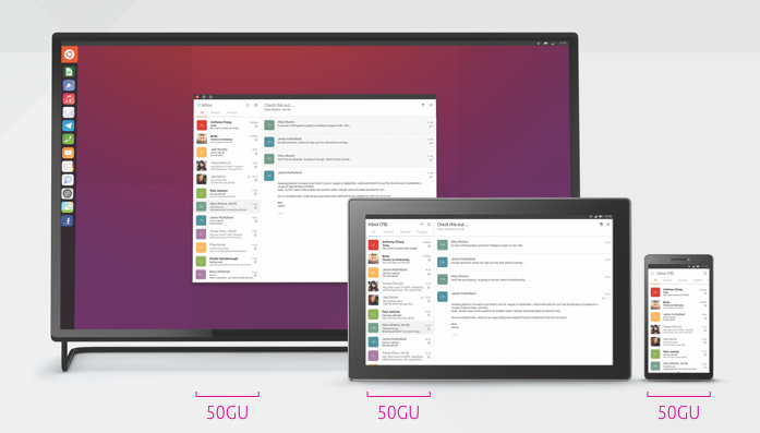
Changing the size of the window resizes one or more joined panels. Typically, the right-most panel resizes and the left-most panel maintains its original dimensions. The dimensions of the right-most panel will normally be 40 or 50 grid units; though this panel may itself be resizable depending on the developer’s requirements.
Example – 50GU phone and 50GU/variable on a desktop screen
The panel that is defined as the main panel (for example 50GU) will initially be visible in the first (leftmost) column; this will have to be specified by the developer. The subsequent columns can then be added depending on the device layout.
Good practice
Use a fixed panel
To provide a consistent user experience across the whole platform leave at least one of the panels fixed at a minimum size of either 50 or 40GU inside each screen size. This creates a familiar experience from mobile, tablet and desktop.