 Ubuntu Phone documentation
Navigation
Allow the user to retrieve and browse content easily within your scope through great structure and a consistent feel.
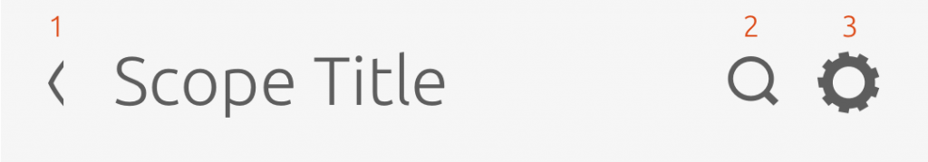
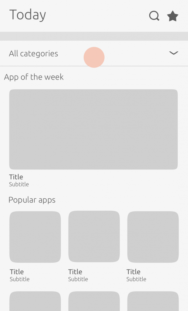
Scope header
The scope header contains the main title of your scope, together with four elements that can take the user to a different screen or perform an action.
Actions
-
Back – present if the scope is opened via tap from an installed scope list as opposed to swiped to in the Dash.
-
Search – allows the user to input a search term.
-
Settings – will take the user to the settings page of the scope where they can enable their location and online accounts to feed the scope.

See our Component section on how to best place these actions inside your scope header.

For more information on how to implement settings in your scope, see our SDK.
Category header
Links to child scopes can be placed within the category header.
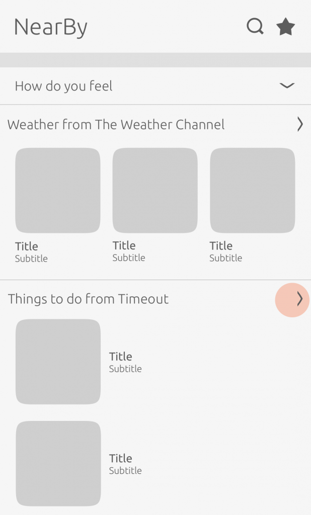
NearBy scope
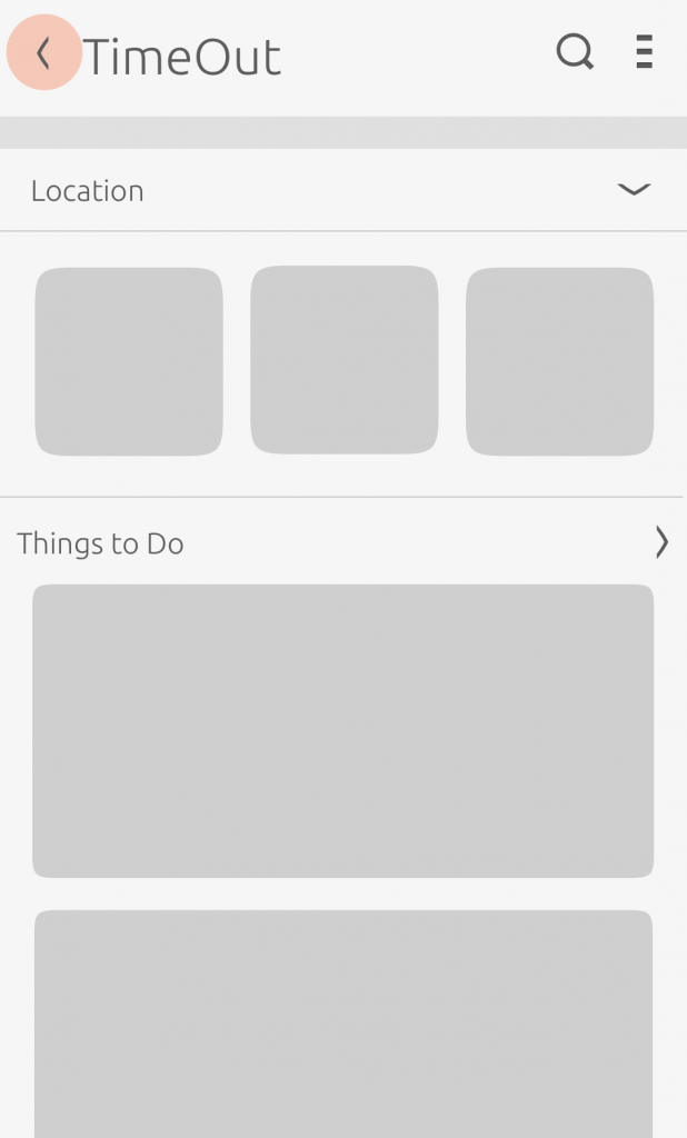
TimeOut scope
If the scope is invoked by an aggregator scope, then it will have a back button.

You cannot swipe to navigate through a scope link. You must use a chevron to indicate to the user that it leads somewhere. As swiping may take the user to the next/previous scope.
Scope links can only be added by the scope author.
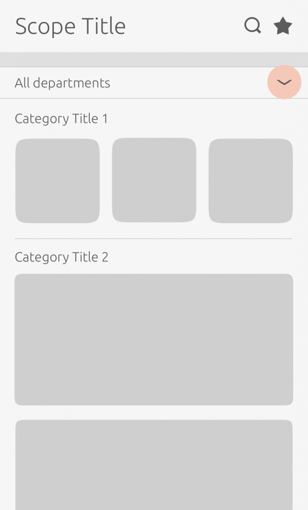
Departments
Departments are an optional feature that can be placed under the scope header to give the user a more targeted and narrower search.
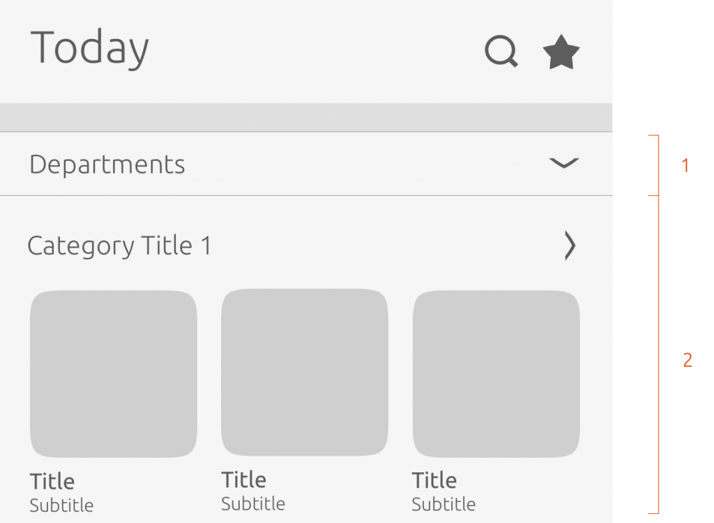
Layout:
-
Department area (below the header) – section of the scope layout dedicated to departments.
-
Content area – section of the scope layout dedicated to categories.
Things you can change:
- Naming the top-level department e.g. ‘Shop by department’ or ‘Genres’
The scope author chooses what content goes in the navigation paths. Categorize your content to give the user easy access to specific results.
Hierarchy
Users can navigate through a scope in a single hierarchy navigation or multiple levels.
Single hierarchy
-
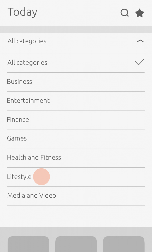
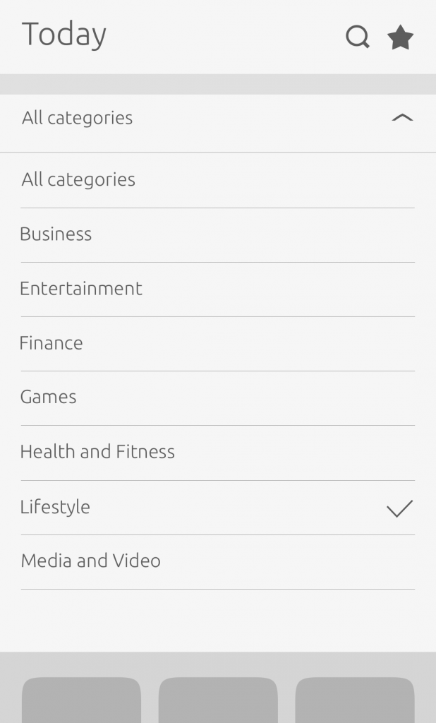
A chevron is used to indicate to the user that there are options available.
-
A checkmark is used to show the user what they have selected.
Behavior of departments:
-
They collapse or expand by default.
-
The widget shows departments returned by the scope per query (including “null” query).
-
When the top-level department is open a maximum of 5 departments can be shown with a ‘show more’ button included.
We use it in some of core scopes such as Music and Shopping, where users can browse by genre or departments.
Learn how to create departments and use them in queries in our SDK.
Multiple level hierarchy
Where there are multiple choices in each department branch, the branch is displayed with a chevron to show that tapping it will open a list of its children, rather than selecting an option and closing the menu.
Department menu
When the user first comes to the scope they will be presented with an ‘all departments’ menu.
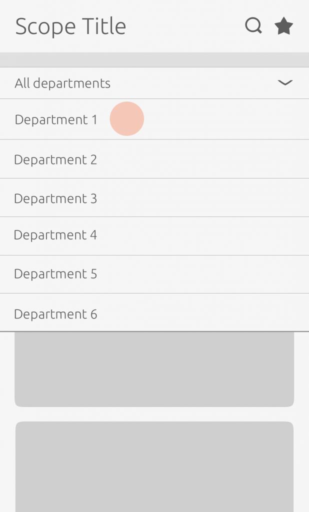
On tap, the menu will expand and reveal a list of available departments.
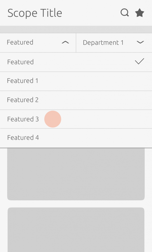
The menu will then split into two rows”Featured” and the selected department.
In the department view the user can navigate back to ‘all departments’ using the back chevron, or select another category or department.
Featured menu
When the user has selected a department, the ‘Featured’ menu will appear on the left hand side of the ‘Department’ menu.

The ‘Featured’ menu allows the user to sort results by order e.g.”Price: high to low”, which changes the view of the results.
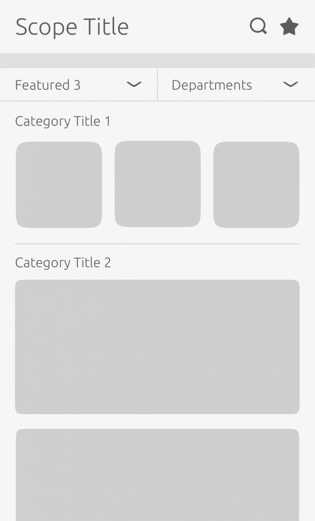
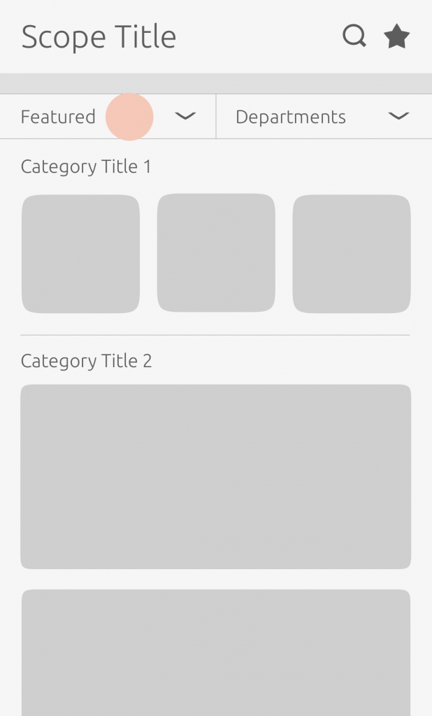
Once the user has selected a feature, the scope page will rearrange the results according to the feature selected.
Where there are multiple choices in each department branch a chevron is used to indicate to the user that there are options available.